
Color Psychology for Small Business: Why It Matters
Color psychology for small business is one of the most underrated tools for building a strong brand. While many small business owners focus on logos, fonts, or taglines, colors do just as much—if not more—to influence customer decisions.
The shades you pick are more than decoration. They’re strategy. The right color palette sets the tone, builds customer trust, and guides consumer behavior. That’s why big companies pour millions into studying which colors resonate. For small businesses, using color psychology effectively levels the playing field.
The Science Behind Color Psychology
Researchers have found that people form opinions about products within 90 seconds of seeing them—and as much as 90% of that judgment is based on color (Verywell Mind).
For a small business, this means color isn’t just about looking good. It’s about shaping how people feel before they even interact with you. If you’re not intentional, your branding could be sending mixed signals.
Every Color Sends a Signal
Colors influence perception in powerful ways. Here’s how common ones work in color psychology for small business:
- Red – Energy & Urgency
Red creates excitement and action. Restaurants use it to trigger appetite, while retail stores use it to drive impulse purchases. - Yellow – Optimism & Warmth
Yellow feels bright and friendly. It’s great for approachable brands, but too much can overwhelm. - Green – Growth & Balance
Green is linked to health, nature, and progress. Small businesses in wellness, finance, or tech often use it to symbolize renewal and trust. - Blue – Trust & Stability
Blue signals dependability. That’s why banks, SaaS platforms, and insurance companies lean on blue (HubSpot). - Black – Authority & Luxury
Black communicates power and exclusivity. Many premium brands use black to appear professional and high-end. - White – Simplicity & Cleanliness
White balances bold colors and creates clarity. Healthcare brands especially rely on white for a sterile, trustworthy vibe. - Purple – Creativity & Royalty
Purple feels imaginative and elegant. Small businesses in design, fashion, or coaching can use purple to stand out. - Orange – Excitement & Friendliness
Orange combines the energy of red with the optimism of yellow. It’s approachable, youthful, and energetic—perfect for fun brands.
Real-World Examples of Color Psychology in Action
- McDonald’s: Red + yellow = hunger + quick decisions.
- Starbucks: Green = balance + community + relaxation.
- Facebook & LinkedIn: Blue = trust + professionalism.
- Apple: Black + white = sleek, modern, premium.
These aren’t random choices. They’re deliberate uses of color psychology for small business and enterprise branding alike.
How to Choose the Right Colors for Your Business
Choosing colors isn’t about your personal favorite—it’s about branding strategy. Here’s how to decide:
Step 1: Understand Your Audience
- Younger customers → bright, bold colors
- Professionals → muted tones, blues, grays
- Health-conscious → greens, blues, neutrals
Step 2: Match Your Brand Personality
- Fun/playful → orange, yellow, bright blue
- Serious/professional → navy, black, gray
- Premium/exclusive → black, gold, purple
Step 3: Study Competitors
Check what colors dominate your niche. You can either align with industry expectations or deliberately stand apart.
Step 4: Test and Adjust
Use mockups, polls, or A/B tests to see how people respond. Tools like Coolors or Adobe Color can help you experiment.
My Approach at Black Swamp
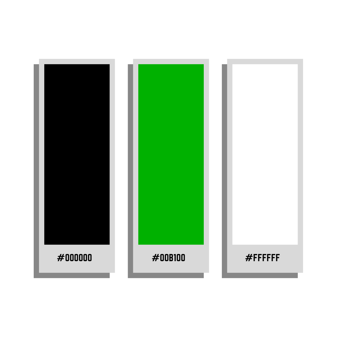
When I built Black Swamp Internet Marketing, I didn’t choose colors at random. I chose:
- Black → authority + professionalism
- Green → growth + opportunity
- White → balance + approachability
This wasn’t just aesthetic. It was color psychology for small business branding applied to my own company. The palette made my business feel trustworthy yet approachable—a balance my clients appreciate.
Advanced Tips for Applying Color Psychology
- Limit Your Palette → Stick to 2–3 primaries + 1–2 accents.
- Use Contrast Wisely → High contrast makes CTAs (like “Buy Now” buttons) stand out.
- Stay Consistent → Use your colors across your site, socials, and offline branding.
- Consider Culture → Red is lucky in Asia, but urgent in Western markets.
- Accessibility First → Check contrast ratios so text is readable for everyone.
Practical Applications for Small Businesses
- Logos: Anchor your entire identity.
- Websites: Guide the user journey with contrast and emphasis.
- Social Media: Keep a consistent palette for instant recognition.
- Print: Flyers, menus, business cards should all align.
👉 Need help building consistent branding? Check out our Web Design Services and SEO Services at Black Swamp.
FAQs: Color Psychology for Small Business
What is color psychology for small business?
It’s the study of how colors influence customer trust, emotions, and buying behavior in small business branding.
Can color psychology for small business really boost sales?
Yes. Studies show that strategic use of color influences purchasing decisions more than copy or price.
How many colors should I use?
2–3 main colors plus 1–2 accents is best for visual identity and small business marketing.
Should I use bright or neutral colors?
Bright colors connect with playful, youthful audiences. Neutral palettes connect with serious or premium audiences.
Final Thoughts
At the end of the day, color psychology for small business isn’t about decoration—it’s about impact. The colors you choose influence consumer behavior, inspire customer trust, and strengthen your branding strategy.
Whether you’re opening a local café, building a tech startup, or running a professional service, your palette is one of the cheapest yet most powerful marketing decisions you’ll ever make.
Apply it with intention, stay consistent, and you’ll build a brand that customers recognize and remember.
Color Psychology for Small Business: Why It Matters
Color psychology for small business isn’t just some design trend. It’s one of the most powerful tools you can use to shape how people see your brand. The colors you choose are more than decoration—they tell a story, influence emotions, and guide decisions.
Think about it. Before customers ever read your website copy or check your prices, they feel something based on your branding. The right colors can make your business look trustworthy, exciting, fresh, or premium. The wrong ones can confuse customers or even push them away.
Big corporations have studied this for decades. There’s a reason banks use blue, organic brands use green, and fast food chains use red and yellow. These choices aren’t accidents—they’re rooted in psychology. For small businesses competing against bigger players, understanding color psychology is your secret weapon.
The Science of Color Psychology
Color psychology is the study of how colors affect emotions and behavior. Scientists have found that people form impressions within 90 seconds of seeing something, and up to 90% of that judgment is based on color alone. That’s huge.
For small business owners, this means your colors aren’t just a style choice—they’re a strategy. If you’re not intentional about your palette, you might be sending the wrong message without realizing it.
Every Color Sends a Signal
Here’s a breakdown of what some common colors mean in branding and marketing:
- Red – Energy & Urgency
Red grabs attention and creates excitement. It’s why clearance sales and “Buy Now” buttons are often red. For food businesses, red can even trigger appetite. - Yellow – Optimism & Warmth
Yellow feels cheerful and welcoming. It’s great for creating a friendly, positive vibe, but too much can feel overwhelming. - Green – Growth & Balance
Green is tied to health, nature, and prosperity. It works well for eco-friendly, wellness, and finance businesses. Tech companies also use green to signal innovation. - Blue – Trust & Stability
Blue is one of the most popular branding colors. It feels safe, dependable, and calming. Banks, insurance companies, and SaaS platforms love blue for that reason. - Black – Authority & Luxury
Black communicates power, sophistication, and exclusivity. High-end fashion and luxury brands often use black to create a premium feel. - White – Simplicity & Cleanliness
White balances stronger colors and gives brands a clean, minimalist look. Healthcare and tech brands often use white for clarity and simplicity. - Purple – Creativity & Royalty
Purple suggests imagination, wisdom, and even luxury. It works for brands that want to feel artistic, spiritual, or upscale. - Orange – Excitement & Friendliness
Orange blends the energy of red with the optimism of yellow. It feels fun, approachable, and energetic—great for playful brands.
Real-World Examples of Color Psychology
- McDonald’s: Red and yellow create hunger + excitement → quick service decisions.
- Starbucks: Green communicates growth, balance, and a relaxing coffeehouse vibe.
- Facebook & LinkedIn: Blue signals trust, safety, and professionalism.
- Apple: Black, white, and gray create a sleek, modern, premium feel.
These aren’t coincidences. They’re deliberate choices that keep these brands at the top of people’s minds.
How to Choose the Right Colors for Your Business
When choosing your colors, don’t start with what you like. Start with who your audience is and what you want them to feel.
Step 1: Know Your Audience
- Younger audiences → brighter, bolder colors
- Professional audiences → cleaner, muted tones
- Health-conscious audiences → greens and blues
Step 2: Match Your Brand Personality
- Fun & playful → yellows, oranges, or bright blues
- Serious & professional → navy, black, or gray
- Premium & exclusive → black, gold, or deep purple
Step 3: Study Competitors
If every competitor in your niche uses blue, maybe you want to stand out with green or orange. But don’t go so far off that customers don’t recognize your industry.
Step 4: Test & Adjust
Mock up your website, logo, or product packaging with different palettes. Ask for feedback from your audience. You’d be surprised at how strong reactions to colors can be.
My Approach at Black Swamp
When I built Black Swamp Internet Marketing, I didn’t pick colors randomly. I went with black, green, and white:
- Black → authority and professionalism
- Green → growth and opportunity
- White → balance and approachability
This combo made my brand feel trustworthy while still fresh and modern. That’s the power of color psychology for small business branding—choosing intentionally makes your brand stronger.
Advanced Tips for Using Color Psychology
- Limit Your Palette → Stick to 2–3 main colors and 1–2 accents. Too many colors feels messy.
- Use Contrast Smartly → High-contrast palettes (like black + white + a bold accent) grab attention.
- Apply Consistently → Use the same colors on your website, social media, signage, and print materials. Consistency builds recognition.
- Think About Culture → Colors mean different things around the world. Red = luck in China, but warning in the West.
- Accessibility Matters → Make sure your colors are easy to read for people with vision differences.
Practical Applications
- Logos → Your logo is your brand’s first impression.
- Websites → Color guides navigation and emotions. (Example: Red “Buy Now” button for urgency.)
- Social Media → A consistent color palette makes your posts instantly recognizable.
- Print Materials → Business cards, flyers, and signage should match your digital branding.
FAQs About Color Psychology for Small Business
What is the best color for a small business?
There’s no single “best” color. It depends on your audience and industry. Blue works for trust, green for growth, red for excitement.
Can I combine bold and neutral colors?
Yes! Pair a bold color (like green or orange) with neutrals (like black or white) for balance.
How many colors should my brand use?
Most successful brands use 2–3 main colors plus 1–2 accent colors.
Does color really affect sales?
Yes. Studies show color influences purchase decisions, sometimes more than price or text.
Final Thoughts
Color isn’t just a design choice. It’s psychology, strategy, and branding all rolled into one. For small businesses, mastering color psychology can make the difference between blending in and standing out.
When you use color psychology for small business intentionally, you’re not just making things look nice—you’re building trust, attracting the right audience, and driving sales.
So next time you’re designing a logo, building a website, or even painting your storefront, don’t just pick your favorite shade. Pick the colors that tell your story and move your customers to action.
Color Psychology for Small Business: Why It Matters
Color psychology for small business is one of the most powerful branding tools you can use. The colors you choose instantly set the tone, influence buying decisions, and tell your customers how to feel about your brand.
Big companies know this, which is why entire industries stick to the same color patterns. It’s not coincidence—it’s strategy. If you want your small business to stand out, choosing the right colors can make all the difference.
Every Color Sends a Signal
Colors aren’t just “pretty.” They trigger emotions and expectations. Here’s how some of the most common colors work in branding:
- Red & Yellow – Appetite & Urgency
Fast food giants like McDonald’s and Wendy’s use these because they make people feel hungry and excited. Red is energy, yellow is optimism—and together they drive quick decisions, like grabbing a burger. - Green – Growth & Balance
Popular with tech brands like Spotify and WhatsApp, green signals innovation, progress, and trust. It’s also tied to health and wellness industries because it feels fresh and natural. - Blue – Trust & Stability
Banks, software companies, and insurance providers lean on blue because it feels safe and reliable. If your business depends on building trust, blue is a go-to. - Black & White – Authority & Simplicity
Black feels bold and professional, while white keeps things clean and approachable. Together, they create a sleek and modern look.
How to Choose the Right Colors for Your Business
Picking colors isn’t about what you personally like—it’s about what works for your audience and your message. Here’s what to think about:
1. Your Target Audience
Who are you trying to reach? Younger audiences may respond well to bold, fun colors. More professional or older audiences may prefer clean and stable tones.
2. Your Brand Personality
Are you playful, serious, approachable, or premium? Your colors should match your tone. A playful kids’ brand will use brighter shades, while a high-end law firm might stick to muted, confident tones.
3. Your Competition
Look at what others in your space are doing. You don’t want to blend in completely, but you also don’t want to confuse people with something that feels unrelated. The sweet spot is standing out while still fitting expectations.
My Approach at Black Swamp
When I built Black Swamp Internet Marketing, I didn’t just pick colors at random. I chose black, green, and white for a reason:
- Black communicates professionalism and authority.
- Green reinforces growth and opportunity.
- White balances everything out and makes the brand approachable.
This combo gives me a look that’s bold and trustworthy, while still feeling fresh. That’s the power of using color psychology for small business branding with intention.
Practical Tips for Testing Colors
If you’re not sure what direction to go, here are a few easy steps:
- Research your audience → What colors do they naturally respond to?
- Study your competitors → What works for them, and where can you stand out?
- Create test palettes → Mock up your website, social posts, or packaging in different color schemes.
- Get feedback → Ask customers, friends, or even run polls to see what resonates.
- Stay consistent → Once you pick your palette, use it everywhere—website, social media, business cards, signage. Consistency builds recognition.
FAQs: Color Psychology for Small Business
What is the best color for a small business logo?
It depends on your industry and audience. Blue is safe for trust, green works well for growth and health, while red can spark urgency.
How does color psychology affect customers?
Colors trigger emotions—like excitement, trust, or calm—that directly impact buying decisions.
Should I use bright or neutral colors?
Bright colors work well for fun, youthful brands. Neutral tones are better for professional, premium, or luxury services.
Can I mix bold and simple colors?
Yes. Many brands use a bold primary color paired with neutrals to balance things out. For example, a bold green paired with black and white.
Final Thoughts
Color is one of the cheapest but most powerful branding tools you have. The right palette can influence buying decisions, spark emotions, and make your brand unforgettable.
Whether you’re opening a café, launching a tech startup, or offering professional services, take time to pick colors that work for your audience—not just ones you personally like. When your colors align with your brand story, you’ll attract the right people and build lasting recognition.
That’s the real value of color psychology for small business—it helps you build a brand people remember and trust.